
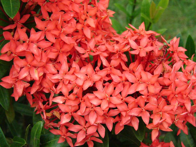
Pantone released its shade of the year for 2019, drifting from 2018’s Ultra Violet to the lively yet still smooth tone Living Coral (16-1546).
Pantone depicted the shading as grasping us with “warmth and nourishment to provide comfort and buoyancy in our continually shifting environment.”
Living Coral and every one of the hues Pantone releases are anticipated as being occasional top choices and are a dependably fun method to add a touch of shading to your wedding day in the event that you know-how.
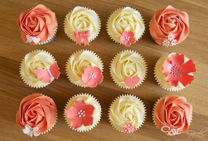
Hued Cake

Leave the plain white wedding cake in the past! Using current patterns like marbling, geometrics and hand-painted subtleties in striking hues like Living Coral can make an eye-catching sweet for your participants.
Bridesmaid Arrangements
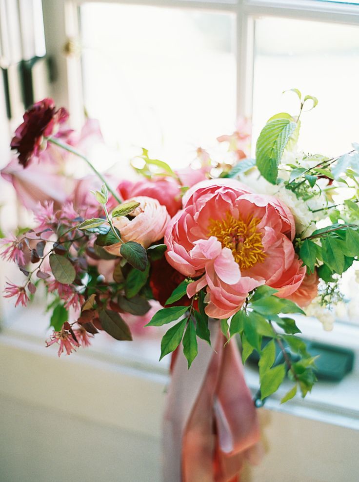
Attempt a fun and eccentric search for your wedding by enabling your bridesmaids to convey intense hued bunches in shifting shades of your freshly picked hues. To make this strategy work and look strong ensure the floral arrangements are similar in shape and size to make a formal cohesive look.
Related Article:
Delectable Desserts
“Sociable and spirited, the engaging nature of Living Coral welcomes and encourages lighthearted activity,” Pantone said of their eclectic color, “Symbolizing our innate need for optimism and joyful pursuits.”
Adding this exuberant shading or some other warm shade of your choice makes a great impact so utilizing these hues in thought out areas, for example, a dessert bar can draw visitors without signs or flags guiding them.
Spruced up Drinks

There are a lot of ways you can create shading in your beverages from the decision of straws given out to the beverage itself.
Making a mixed drink for your bartender to make with a sprinkle of your picked shading is an incredible method to enable visitors to help carry your color all through the room.
Incredible Paper
Pantone referenced that Living Coral, “emits the desired, familiar and energizing aspects of color found in nature. In its glorious, yet unfortunately more elusive, display beneath the sea, this vivifying and effervescent color mesmerizes the eye and mind.”
What a tempting color! Have an expert craftsman add this intense shading to invitations, place cards and more.
While shading can be fun it can likewise be overpowering so keep these tips and systems in mind, and don’t go overboard. Picking just a few hues is best.
In case you’re searching for even more of a pop attempt two complementary hues like orange and blue, yellow and violet or red and green (try fluctuating tones to stay away from a vacation impact).
James Novotny
Staff Writer