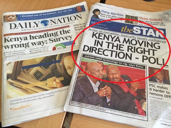
One thing I can’t stand both as someone who reads the news and as a member of the media, is when people are misled. It can be due to headlines, opinions stated as facts, graphs, clickbait titles and perhaps most notably, half true statistics.
These are prevalent in the media and really came to my attention after the Stoneman Douglas High School shooting back in February. Begrudgingly I used school shooting statistics from the advocacy group Everytown for Gun Safety. It was the main one that I found on short notice but even then I tried to clarify how it could be misleading.
However, after digging further, Everytown is an organization fronted by former New York City mayor Michael Bloomberg and Shannon Watts, a gun control advocate. Due to that it is a very biased source that doesn’t tell the whole truth with their statistics.
Also, the way news outlets present Everytown’s statistics is misleading and wrong. You see it everywhere: “So far 44 different schools shootings have occurred in 2018 alone!” And when you think school shooting, you think of very deadly ones that get the most coverage, such as Stoneman Douglas or Sandy Hook.
However the criteria used to determine a “school shooting” by Everytown is way too broad. The group counts any instance of a gun firing at a school or even on its property as a school shooting. Several of these cases resulted in no injuries or deaths at all or were isolated incidents that weren’t mass shootings. And I believe lumping those in with devastating school shootings with multiple injuries and/or deaths is wrong.
Everytown reported a total of 44 school shootings occurring this year so far. Out of those 44, 19 of them resulted in no injuries. 11 out of 44 resulted in death, and 14 of the total shootings were isolated cases with one or two people suffering injuries.
In total, 25 of these 44 shootings led to 54 people injured and 41 deaths. These numbers are still sad and should be much lower, but are still being misinterpreted in the media.
 The popular statistic being thrown around is that a school shooting happens at least once a week and the stat is only growing. Even former president Barack Obama parroted this fact. However, school shootings that are the caliber of the Stoneman Douglas and Sante Fe shootings are not the norm. They do not happen once a week, and every time that stat is used it is misleading.
Should we be alarmed and taking more action to stop these from happening in the first place? You betcha. But we shouldn’t be throwing additional, incorrect fuel into the fire.
Yet this is far from the first time numbers and data are manipulated to paint deceitful truths. For example, take a look at almost any bar graph used in news broadcasts.
Many times, they’ll try to trick you by setting the y-axis at an arbitrary number other than 0, for instance, 34. So the graph will start at 34, and the bar will look small. The next number is 36, and it’s as tall as the entire graph, signifying a massive difference from the previous number. This all due to the way the graph is scaled and designed.
These are everywhere in the news and people (myself included despite my best efforts) fall for them all the time.

There are also several tactics used to create misleading statistics to validate a publications agenda. This includes selective definitions (such as Everytown’s school shooting stats), sampling bias and correlation and causation.
Sampling bias occurs when a study fails to interview a diverse roster of people with different beliefs. For example, conducting a survey of 1,000 people and asking them if semi-automatic rifles should be banned is useless if 900 of those people are all NRA members from Michigan. Yet people would use that information to represent the whole U.S.
Correlation and causation is another nasty practice used to mislead people. This is when two unrelated patterns are believed to be a cause and effect relationship.
The oldest example is this: More people are buying ice cream at the beach during the 2015 summer months. At the same time, there is an increase in the number of drowning incidents at the beach. So obviously, ice cream is murder.
It’s an outlandish example but you get the point. This kind of twisting of facts is all around, and is an easy trap for those of us that don’t have a lot of knowledge in the field of statistics to fall into.
 Now that information is so readily available to anyone with access to the internet, it’s easy to pick and choose what truths to include in graphs, charts, figures and statistics.
The scary part is that there is no real solution to this. The general public will not take the time or initiative to investigate these claims and we don’t have a designated person to fact check everything that comes around our Facebook or Twitter.
In the end, we have to step up, and be more diligent in snuffing out the misleading figures much of the media uses. So the next time you see a news article link to the details of a study, check it out for yourself and see how it holds up.
Henry Wolski
Executive Editor


